How I learnt about accessibility as a junior developer
As a developer, you want to ensure your work is accessible, but it can be hard to know where or how to start. You’ve been trained to write semantic HTML & add alt tags, but is that enough? What about a Lighthouse score of 100 — does that cover everything? (Hint: It doesn’t!)
These were the questions on my mind when I worked on my first commercial frontend project. Fortunately, I had a pair programming session planned with our Tech Community Lead, Michael Strutt - who provided some beginner-friendly tips to get started. I thought it's only fair I share it with people in the same boat as me!
Bear in mind:
I'm not going to go into writing semantic HTML— let’s assume we’re using HTML5 Doctype, inputs have labels, the structure has a header & footer, sections and articles have been used (Proper guidelines on developing for accessibility)
I discovered some accessibility improvements after the project was launched - but I’m sharing them in this article as they’re relevant.
An example website accessibility project
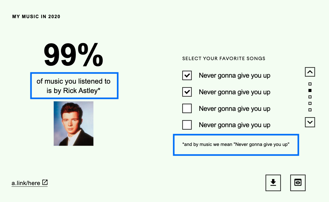
This project contains 5 cards that follow the structure below:
There’s plenty to work with in these cards. Each of them have the following elements which need consideration:
- Lists
- Custom checkbox
- Custom pagination
- Links
- Non-descriptive CTAs
- Footnotes
Step 1: Automated tools audit with Lighthouse & Axe
Automated tools are great for ensuring our project meets basic rules of accessibility. For example, missing alt tags, valid HTML, meeting WCAG guidelines. What they won’t give you feedback on is the quality and meaning of your alt descriptions, general usability and semantics.
In case you haven't used Lighthouse before, it's part of the Chrome Developer Tools, checkout the guide to getting started with lighthouse. You can find the Axe extension in the Chrome WebStore.
Color Contrast
Issue: Background and foreground colors don’t have sufficient contrast making it difficult or impossible for users to read.
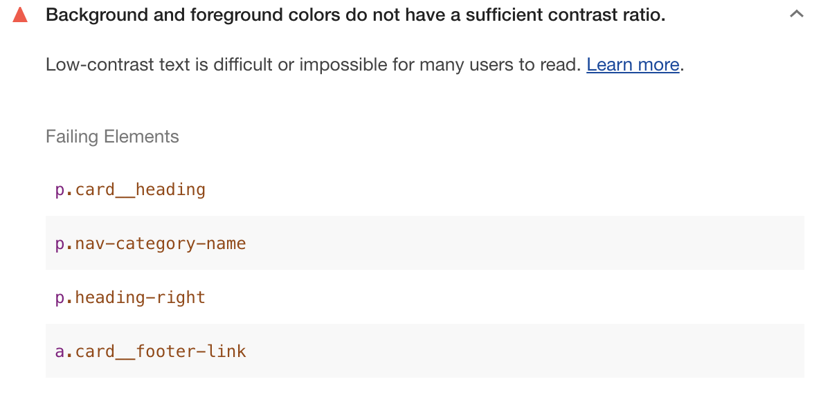
WCAG 2.0 level AA requires a contrast ratio of at least 4.5:1 for normal text and 3:1 for large text.
Solution:
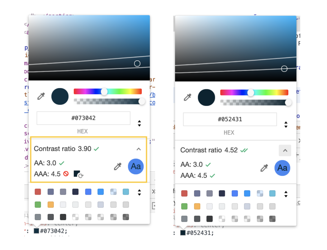
Navigate to failing elements in dev tools.
Under ‘Styles’, go to it's color property and click on the color box.
Expand the contrast ratio accordion and hit the refresh symbol on the color box next to: “AAA:4.5”
Missing alt tags & aria labels
While learning web development, it's pretty much drilled into our brains that we must use alt tags. However, when you’re working on a large codebase, it's easy to miss the odd one or two. This is where Lighthouse comes in handy as it provides a list of failing elements where you’re missing descriptive text.
It also gives you a useful list of manual checks you should perform. For example:
We realised our custom scroll elements could do with an aria-label as the buttons were only represented with arrow symbols (and no text).

<a class="up-arrow"
  aria-label="Scroll to the previous card">
  <img src="img/scroll-down.svg"
	  alt="Scroll to the previous card"/>
</a>

<a href="#summary" class="scroll--circle"
  aria-label="Scroll to Summary card">
</a>
The reason we’re using an aria-label on the button and an alt tag is because the two serve different purposes. The alt tag will provide a text alternative for users that are unable to see the image (for example, if it fails to load). If we just have the alt tag, screen reader users won’t know about pagination until they’ve tabbed through the page and arrived on this button.
The aria-label , however, will make this information immediately available. The buttons will show up in the list of form controls with the name “Scroll to the previous card” and “Scroll to the next card”.
Using aria labels as tooltips
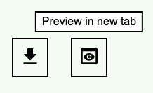
We also added aria-label to the download and preview buttons. With the help of some CSS, these labels can also show up as a tooltip for the buttons.
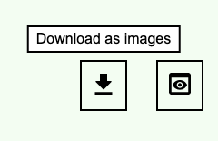
<a href="<url>" aria-label="Download as images"
  class="tooltip">
  <img src="img/download.svg" alt="Download">
</a>
Styling the tooltip using aria-label with scss:
.tooltip {
 position: relative;

 &:hover,
 &:focus-visible {
   &::before {
     background-color: $white;
     border: solid 2px $black;
     color: $navy;

      /* To use aria-label attribute as tooltip text */
     content: attr(aria-label);

     display: block;
     left: 50%;
     padding: .25rem .5rem;
     position: absolute;
     top: -40px;
		 transform: translateX(-50%);
     white-space: nowrap;
  }
 }
}
Changing anchor elements to buttons for scroll up and down
Often when you make one accessibility change on an element, it gives you a chance to rethink if there’s a better way to write it altogether.
Since the “up” and “down” controls for pagination don’t need an href attribute, we realised these could be button elements instead of a elements. This won’t cause any confusion for users that might intuitively perceive them as buttons instead of links. Using buttons would also mean that users can press 'enter' or 'space' to make use of its functionality.
<button class="up-arrow"
  aria-label="Scroll to the previous card">
  <img src="img/scroll-down.svg" alt="Down arrow"/>
</button>

<a href="#summary" class="scroll--circle"
  aria-label="Scroll to Summary card">
</a>
Associated Reading: Anchors, Buttons, and Accessibility
Links with the same name
Issue: We have two links that are called ‘LEARN MORE’ in the footer. This doesn’t provide sufficient information about the links to users following the tab order.
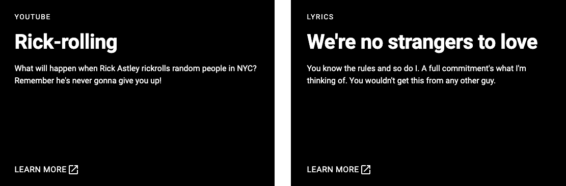
Solution:
We added an aria-label on both links which provides the user further context to decide whether they want to follow the link.
<a href="https://www.youtube.com/watch?v=ZVQfR27ISjM"
  target="_blank"
	aria-label="Learn about Rick-rolling on YouTube(Opens in new tab)">
	Learn more
</a>
Associated Reading: Ensure that links with the same accessible name serve a similar purpose
A note on opening links in new tab
“Opening new windows automatically when a link is activated can be disorienting for people who have difficulty perceiving visual content, and for some people with cognitive disabilities, if they are not warned in advance.”
W3C Source: Giving users advanced warning when opening a new window
Ideally, it would be great if the browser could visually inform the user about how the link will be opened. In the meantime, here are some of the ways we improved accessibility:

Making the tooltip text informative:
As mentioned previously (and demonstrated in this JSBin) - you can use aria-label to inform screen readers about functionality as well as use that label as a tooltip. By adding “in new tab” in this label, you can now warn both screen readers and visual users about links opening in new tabs.
Step 2: Look at the HTML without any CSS
Go to devtools and delete the stylesheet! This is great for improving HTML semantics and heading hierarchy as well as making your website screen reader friendly.
Remove unnecessary headings or divs
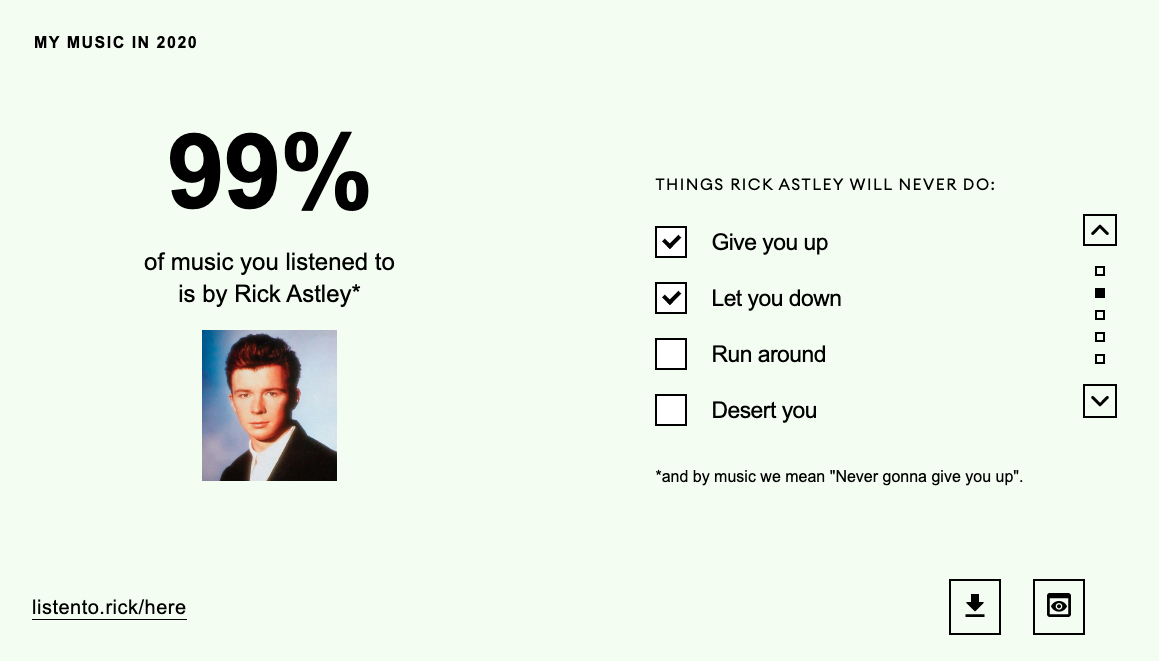
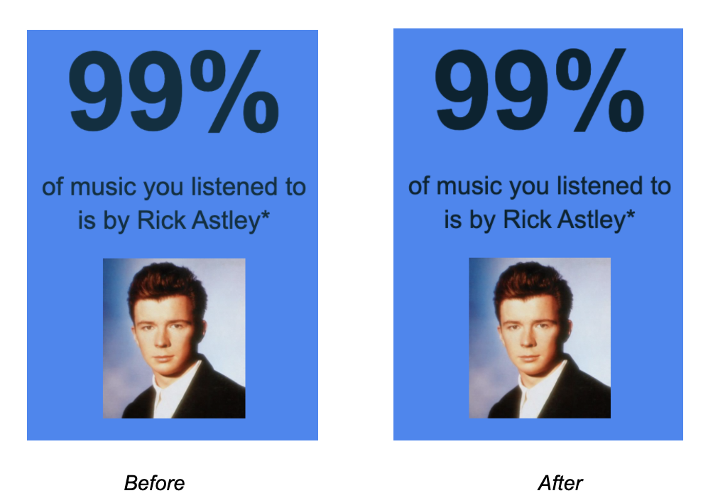
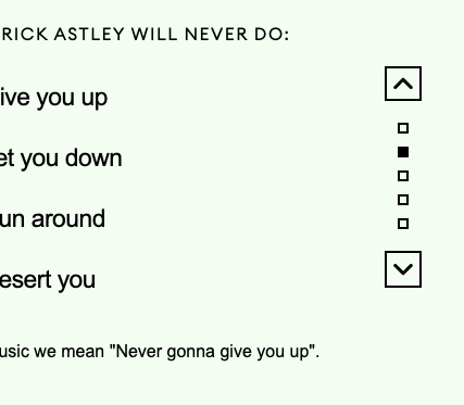
Issue: On each card we have elements that need to visually look like separate headings, but still read as one sentence. Before considering accessibility, “99%” was an <h1> and “of music you listened to is by Rick Astley*” was an <h3>.As a result, the headings would be visually seen as a single sentence, but wouldn’t be read out by the screen reader as one.
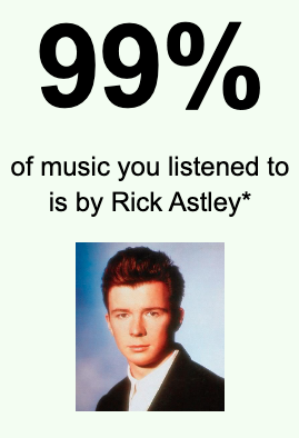
<div>
 <h1 class="category-number">99%</h1>
 <h3 class="category-sub">
  of music you listened to is by Rick Astley*
</h3>
</div>
Solution: We corrected this by using <span> inside <h1>.
<h1> <span>...</span><span>...</span></h1>
This way, the element is still a heading for semantic reasons, however, the screen reader will read this as “99% of music you listened to is by Rick Astley*”.
<h1>
 <span class="category-number">99%</span>
 <span class="category-sub">of music you listened to is by Rick Astley*</span>
</h1>
Linking Footnotes
Issue: When footnotes are added using the * symbol, the user should have access to additional information immediately. Currently, the user makes the connection between the two elements visually, however, the relationship is not obvious for users accessing the website via a screen reader.
Solution: Use aria-describedby
<h1 aria-describedby="astley-footnote">
  <span class="category-number">99%</span>
  <span class="category-sub">
	  of music you listened to is by Rick Astley*
	</span>
</h1>

<p id="astley-footnote">*and by music we mean "Never gonna give you up".</p>
Step 3: Tab through your website using your keyboard
Use this method to check for focus order, focus indicators, user actions and keyboard traps.
Custom Checkboxes had no visual focus indicators
We made custom checkboxes using this handy solution from CSS tricks: https://css-tricks.com/the-checkbox-hack/.
.checkbox {
  &__input {
    left: -99999px;
    position: absolute;
 }

  &__box {
   //Custom checkbox design
  }

  &__input:checked ~ &__label &__box {
   //Checked custom checkbox design
  }
}
Essentially what this does is:
- Removes the actual input for the checkbox from the user’s view
- Replaces the checkbox with our custom design under the label
Issue: Because we used a native checkbox, the user can tab to it and interact with it as expected. However, as we hid the native element to show our custom one, the focus indicator (the blue outline) is also hidden from the user.
Solution: Apply custom focus styles (in our case a box shadow) on the custom checkbox when the native checkbox is in focus.
.checkbox {
  &__input:focus ~ &__label &__box {
   box-shadow: 0 0 0 3px $black;
 }
}
Note: Check out the “Skip to Content” link
While this feature isn’t needed for my project, most websites could definitely make use of the “Skip to Content” link. Essentially, this is a hidden link that gives keyboard users and screen readers the option to jump from the top of the page to the main content without having to go through the navigation area.
See CSS Tricks to learn how to build a ‘Skip to Content’ link.
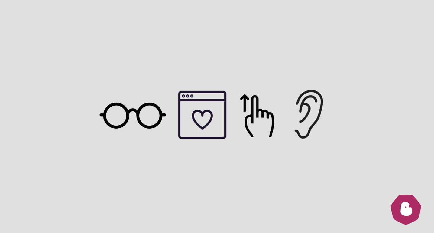
Step 4: Use Screen Readers
Use Screen Readers to ensure the content is read out as expected. The screen reader should also follow the user’s actions on desktop as well as responsive layouts. Like automated tools, I recommend using more than one reader. This way you’re double checking your work on different platforms and browsers, just as you would when you test your work visually. I used ChromeVox and VoiceOver, Apple's inbuilt reader.
Improved alt and description texts:
Through this process I learnt you don't need to write "image of ..." or "button for...". The screen reader does that for you. The descriptive text should define the function of the element - why it’s there and how it works.
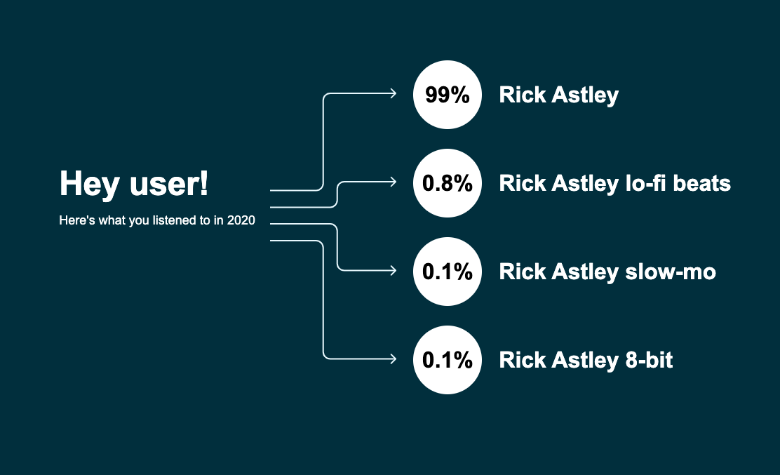
For example, I’d describe the arrows on the card as "Arrows pointing to the user's music listening habits" instead of: "Image of arrows" or "Arrows pointing to the next section".
It also informs the user that “99%” refers to a measurement of listening habits.
With links like listento.rick/here, you don’t want the screen reader to simply read this out. So it now has an aria-label of "Listen to Rick Astley on Youtube (Opens in new tab)"
<a
  href="https://youtu.be/DLzxrzFCyOs"
	target="_blank
	aria-label="Listen to Rick Astley on Youtube (Opens in new tab)"/>
	  listento.rick/here
</a>
Ensuring the screen reader follows a users actions
Issue: Clicking up or down on the custom scroll took the user to the next card, however screen readers remained focused on the previous card.
Solution: Add tabindex=-1 on the card to guide the screen reader. This will help us programmatically move the screen reader’s focus to the card we’ve just navigated to. We used the value of “-1” instead of 0 because, while we want to make the card focusable, we don’t want the card itself to be part of the tab order.
<article tabindex="-1" class="card" id="astley">
This will also add a visual focus ring around the entire card, which isn't needed as it's not an interactive element. To remove this, use the following styling:
.card {
  &:focus{
     outline: none;
  }
}
Associated video: Controlling focus with tabindex -- A11ycasts #04
A note for the future
When I structured my HTML with a focus on reducing the complexity of my CSS, this is how I laid it out:
- Card
- Card headings
- Card body
- Scroll
- Card CTAs
However, after using keyboards and screen readers to navigate through the website, I realised that pagination should be the last in the tab order as it moves you away from the card.
In the future, I will plan the HTML structure keeping accessibility in mind to avoid issues like these. It’s a lot easier to make styling changes in CSS than disrupt the tab order.
Final takeaways from my accessibility project:
This exercise has prepared me to think about accessibility as soon as I start working on a new project. I’ll know to:
- Raise accessibility issues early during the design process to catch out contrast issues, or discuss how we can visually represent a link that will open a new tab.
- Keep the focus order and screen reader in mind when creating the HTML structure
- Use aria-label on non-descriptive links/button
- Connect footnotes or text that can provide a better description or context to an element.
- Test, test, test - and ensure I’ve set enough time aside to do accessibility testing. I found these issues after doing two separate rounds of testing - once in the middle after the basic layout was done and another at the very end.
Below are some articles I’ll be digging into next:
- Make Your Website More Accessible to People with Disabilities
- Starting a new accessibility remediation project? | by Sheri Byrne-Haber, CPACC | Dec, 2020
- Personas with Disabilities. Some people love personas. Some people… | by Sheri Byrne-Haber, CPACC | The Startup
- A Brief History of Screen Readers
- Mobile Screen Reader Testing – Scott Vinkle