Web Development: 9 Overlooked Accessibility Features
Today's hectic development cycle of building, shipping, and scaling quickly can cause us to overlook website accessibility (a11y)
We may work to write semantic HTML where possible and use tested design systems that simplify accessibility, but custom elements and tailored solutions can still lead to a11y being overlooked. This can result in a frustrating user experience for those who rely on such features to navigate the web.
I have summed up a few things that often get forgotten or neglected while working on a project:
- Proper HTML Structure
- Thoughtful use of ARIA
- Live Regions
- Alt-Text
- Descriptive Labels
- CSS
- Keyboard Accessibility
- Media Queries for Motion Reduction or Color Palettes
- "Skip to Content" Link
1. Proper HTML Structure
It is important to reiterate that semantic HTML is a key concept to keep in mind. Using div elements instead of semantic HTML elements such as nav, header, footer, etc. can make it difficult for screen readers to understand the content and can impact the user experience for those with disabilities.
If you need to have a focusable-by-the-reader's HTML element (or the user can navigate to the content by tapping “Tab”) you need to make it this way. Here is a simple guide on how to properly use tabindex.
We can create an interactive custom element by using a div but it is crucial to add a tabindex and properties like role, and aria-label, and including event listeners for keyboard events. If you decide to go with a custom element, please be sure it is focusable, and the user can act on it, or exit it with a simple keyboard tap. Check out the WAI ARIA example patterns page for examples of how to do this right.
2. Abusing ARIA & Bad Design
ARIA (Accessible Rich Internet Applications) is a set of attributes that help make web content and applications more accessible.
ARIA introduces a lot of new attributes and concepts that can be challenging for software engineers to understand and implement correctly. Misusing ARIA can actually make web content less accessible, so it's important to have a solid understanding of how it works before using it.
There is no better way to say it than quote the docs in MDN about ARIA:
'There is a saying "No ARIA is better than bad ARIA." In WebAim's survey of over one million home pages, they found that Home pages with ARIA present averaged 41% more detected errors than those without ARIA. While ARIA is designed to make web pages more accessible, if used incorrectly, it can do more harm than good.
Developers should prefer using the correct semantic HTML element over using ARIA if such an element exists. For instance, native elements have built-in keyboard accessibility, roles and states.'
While it can make certain features more accessible to users with disabilities, it should not be used as a way to compensate for poor design choices. In some cases, it may be better to rethink the design of a feature rather than rely on ARIA to make it accessible. Simply put if you want to reinvent the checkbox, be careful.
It can also add unnecessary complexity to the code. This can make the code harder to maintain and can lead to performance issues.
3. Live regions
One of ARIA's essential features that is often overlooked, is using aria-live to update content on a web page in real time.
Let’s say you have a chat on the page, a little red bubble with a number of alerts for the new message. But how will a screen reader user be notified when something on the page changes?
This is one of the most common mistakes developers make. As the chat feature is available for the screen reader, the notifications are not being updated in real-time. Especially with reactive frameworks today, where only some part of the page changes based on user interaction, we need to have the ability to tell the users that something has changed.
This is where aria-live comes in. By wrapping the element that is being updated with an aria-live, the screen reader will alert the user when something changes. It has two modes: Assertive and Polite. The assertive one will alert the user immediately, cancelling other content, while the polite mode will be less aggressive, annotating the changes after the reader finishes reading the current content.
4. Alt-Text
When creating content for a website, it is important to make sure that images are properly annotated for screen readers. By default, when a screen reader encounters an image, it will try to find the alt text associated with the image. If the alt text is missing, the screen reader will read aloud the filename of the image, which is rarely useful for users.
This gets especially tricky for user-generated images which often get hashed file names containing tens or hundreds of characters. It is always a good idea to provide an input field where the user can describe the image.
If the image is purely for decoration - a pattern for example - and should be skipped by the screen reader, you could use the code alt="", which tells the screen reader to skip the image. However, from our experience, it turns out that this is not enough for some readers and they will announce the presence of an image even though they will skip the URL. You can add role="presentation" which is slightly more explicit but the best and thorough way is to add aria-hidden="true" to the image to ensure it is skipped.
5. Descriptive Labels
Always include labels in the form fields. Let’s stress this out - always!
When working at a fast pace, it's easy to forget to include labels for simple input, progress, select, textarea or other labelable fields.
Labels provide context to screen readers so that users know what is expected of them. For example, an input field may ask for a user's name, but without a label, it wouldn't be clear what the user is supposed to type in.
If you still ask why you need a label, read this first.
Some developers might want to hide the labels though or make them invisible to the user, because they prefer placeholder text instead, using CSS tricks. But the placeholder disappears once you start typing, Also, the screen readers won’t pick up the placeholder text.
6. CSS
It is important to consider how the code will affect accessibility before making a decision. We just stressed out how important labels are. But sometimes the designers want to hide them if they don’t fit well in the design. People are using visibility:hidden, display:none, opacity:0 without paying too much attention.
When dealing with such an HTML element, you need to ask yourself:
- Should I hide it for everyone?
- Should I hide it visually but keep it readable for assistive tech?
- Hide it of assistive tech but keep it visually.
Here is a cool snippet that tackles the issue.
7. Keyboard Accessibility
We have previously discussed the production of customised elements.
Let’s say we have a custom modal with an email input that works as intended - it pops up, and the background darkens, so the user's attention is focused on the modal.
Users who rely on a keyboard to interact with the page may have difficulty closing the modal. It is important to consider if they will be able to use the tab key to navigate the modal's contents if there is a focusable close button, and what will happen if they tab on the last element in the modal. Will they be taken to the content in the background (the actual web contents, which is now a darkened area but still visible to the screen reader) and keep the modal open? Could you close the modal with an “Esc” key?
Using a design system like Material or Bootstrap or a system specially designed with accessibility in mind can prevent all those mistakes with well-predicted behaviour. Still, when creating custom components, the logic of those elements needs to be added manually, which can make the system more prone to errors.
Check out Potato’s Accessible Custom Elements, an open-source library of UI components that are accessible to users who rely on assistive technologies or keyboard navigation.
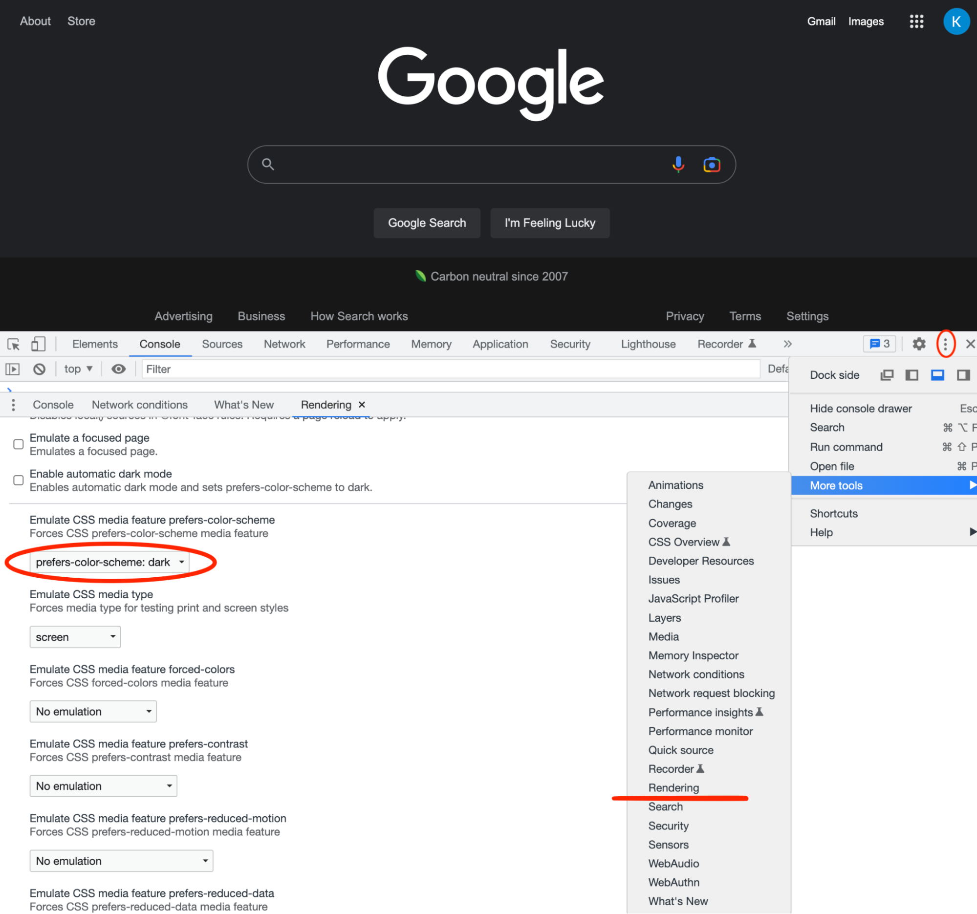
8. Media Queries for Motion Reduction or Color Palettes
We often create a media query for different screen sizes, but one little trick is using a media query to adapt to the user's preferences. If the user has selected dark mode or reduced motion, we can detect those settings and disable the animations or serve our dark mode theme. The user’s preferred colour palette is often about more than just a light/dark preference, but can also be about preferring a higher contrast colour palette for people with a visual impairment. There are pretty cool options to emulate all this in the browser. Here is Chrome for example:
9. "Skip to Content" Link
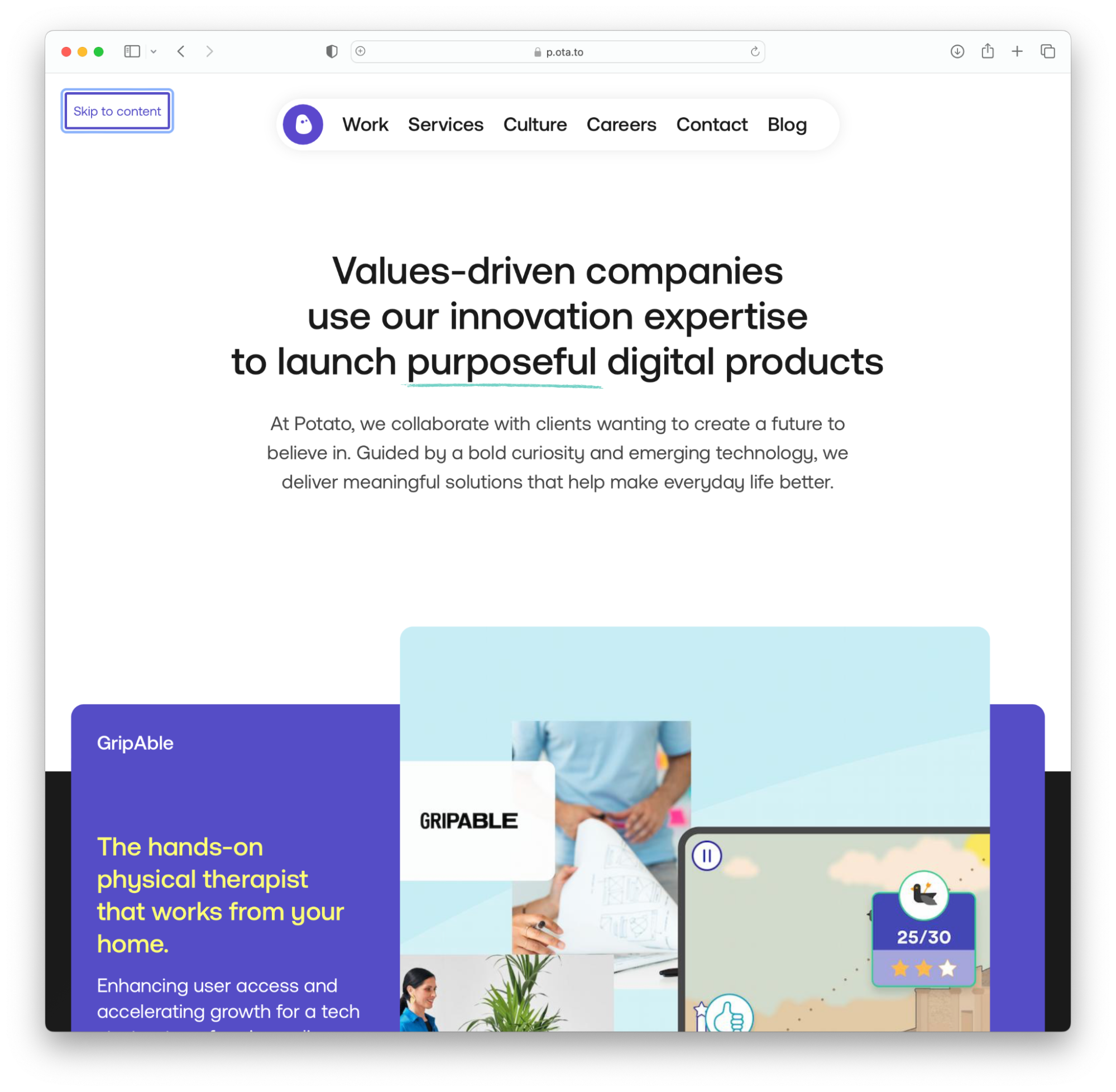
This example from p.ota.to.com shows a good way of using Skip to content.
It is critical for people using screen readers to be able to bypass long navigations and ads and get directly to content when a page changes or is reloaded. Otherwise, they may quickly become frustrated and leave the site. Therefore, it is essential to provide the option of skipping the navigation and going directly to the content.
Discover how you can include a hidden link on your page available only for screen readers.
The takeaway
Technology is becoming increasingly integrated into our lives, so it is essential to ensure that everyone, including those with disabilities, can have equivalent access to websites and applications. It is not only a necessity for legal compliance, but it is also a moral responsibility.
In today's fast-paced environment, developers often overlook accessibility (a11y) needs when building websites. This can result in a frustrating user experience for those with disabilities.
At Potato we strive to create digital products and services that are accessible to everyone. Discover more about our product inclusion approach.